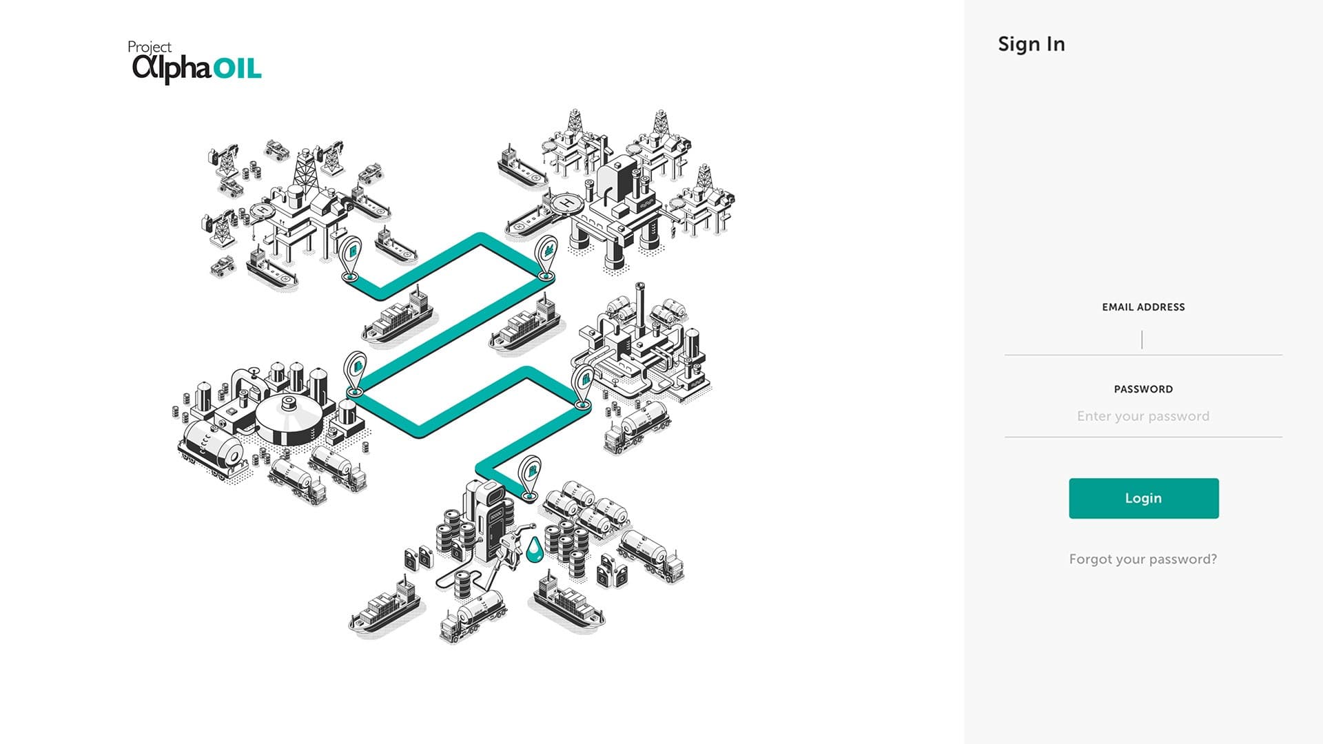
Alpha Oil
Oil & Gas: End-to-End Resources to Retail Data Visualisation
- Client
- Malaysian Oil & Gas Company
- Role
- UX Designer, UI Designer
- Year
- Mar 2019 to May 2019
- Discipline
- Experience Design
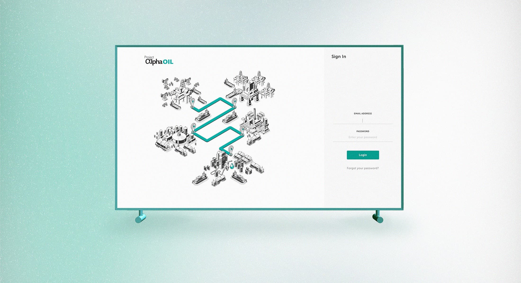
Data plays a vital role in the oil and gas industry. Many companies accumulate valuable data without fully understanding its potential to aid business through informed decision-making. 'Alpha Oil' is a dedicated project concentrating on upstream to downstream data utilisation and visualisation for one of the largest oil and gas companies in Malaysia.
The Challenge
How might we utilise and display complex oil & gas data in a way that is easily digestible without losing the details and the essence of it?
The Goals
- Increase resource to reserve conversion to ensure production sustainability and domestic growth.
- Reduce budget variance.
- Increase profit oil through data transparency and data traceability to inform timely decisions.
- Optimise asset lifecycle value.
- Enable proactive system-based decisions to optimise value across the value chain.
Solution: Information architecture
We started by developing a clear and well-categorised information architecture. The dashboard spans six modules, from a high-level overview through resources and reserves, production, terminal, supply planning and allocation, to optimisation, so every dataset has one predictable home.
Solution: Data visualisation
We created a structured order for the legend colors in highly complex graphs and data visualisations to enhance readability and comprehension. The same ordered palette repeats across every chart type, so a series keeps its color whether it appears in a waterfall, a trend line, a breakdown, or a scatter plot.
Solution: Tooltip utilisation
We utilised tooltips to provide more detailed data and information, ensuring the visuals remain clean and neat. This approach empowers users to choose between analysing data from a high-level perspective or in greater detail.
Solution: Navigation and filtering
We established a consistent navigation and filtering system to minimise the user's learning curve, reducing the time it takes to become familiar with navigating the pages and interacting with data across all sections.
Usability testing
We invited main users to participate in usability testing and A/B trials, aiming to gather feedback and insights that would help validate overall functionality.
Re-iterate
Following a round of usability testing, we observed that users consistently focused on the accuracy of the data rather than the usability of the dashboard, despite multiple reminders that dummy data was being used for testing purposes. We believe it's natural for users to concentrate on the data, given that it's a data visualisation dashboard.
For the next round of usability testing, we decided to display more believable data. This not only aligned better with user expectations but also helped us resolve issues in several charts that only made sense with a realistic data range.
Handover
Multiple iterations and usability tests were conducted, leading to a successful handover of the design to the development team within the agreed-upon timeline.
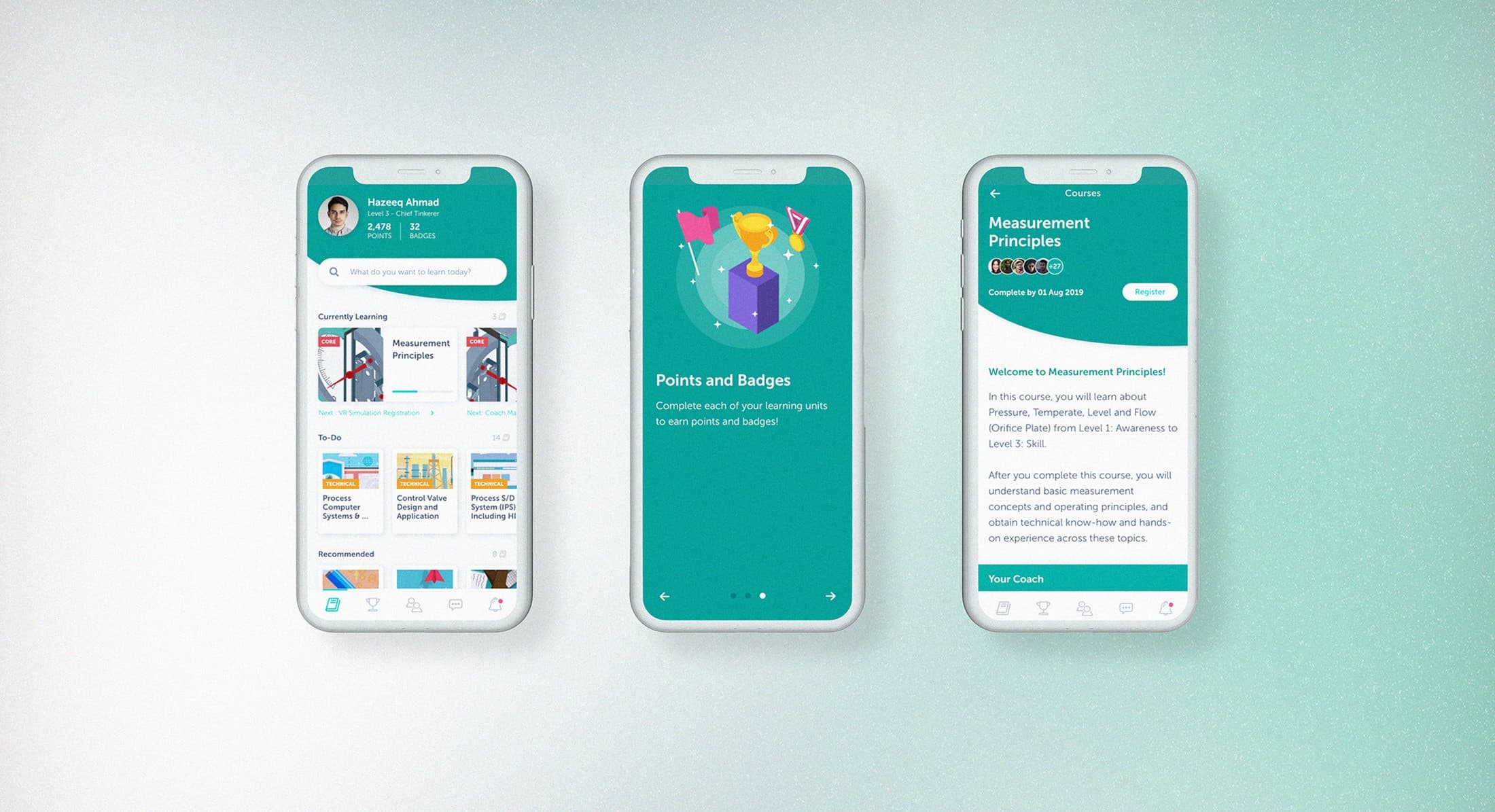
Next case study04
View all workDigital Learning