ARC Pod
A fictional edge data-centre brand built in a day: cinematic 3D site, simulated telemetry, and living brand guidelines rendered by the system they govern.
- Client
- Self-initiated concept
- Role
- Creative direction, brand system & build
- Year
- Jul 2026
- Discipline
- AI-Assisted Development
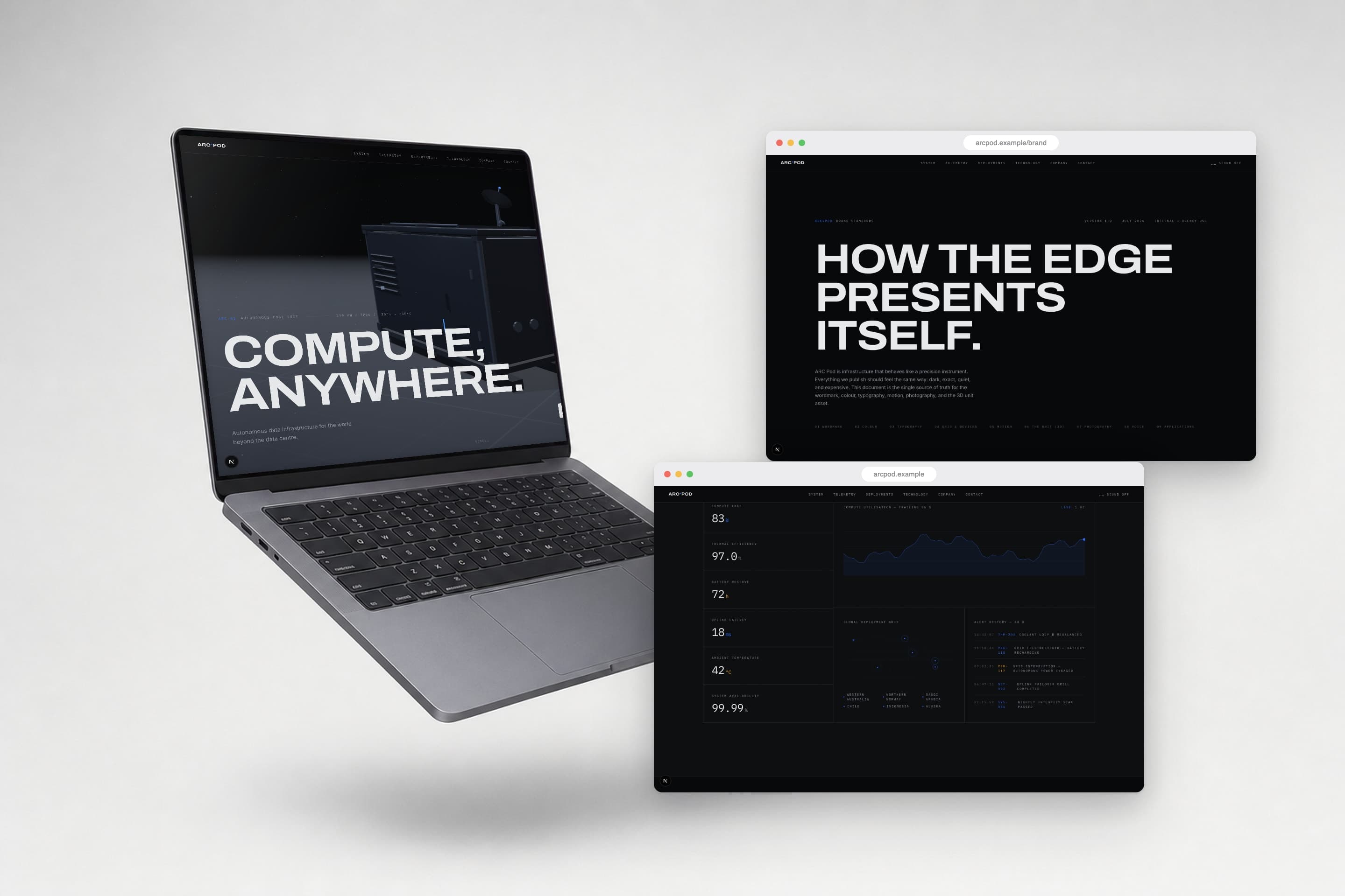
ARC Pod is a company that does not exist. It makes containerised, self-powered AI compute for the places conventional data centres cannot reach: remote mines, offshore platforms, polar research stations. I invented it to answer a practical question, how convincing can a brand become when one person directs an AI through the entire stack in a single day. The answer shipped as three connected things: a cinematic marketing site, a simulated telemetry demo, and the piece this study is really about, a brand-standards manual that runs as a live page of the site itself. Everything is openly fictional and labelled as such on the site; every frame below is the real build running in a browser.
A cinematic site for a fictional machine
The site opens the way the product would: with a boot sequence. A full-screen loader prints an ARC OS boot log, counts to one hundred in mono digits and wipes away to reveal the hero, a procedurally built pod resting on a dark reflective ground, headline set in Archivo stretched to 112 percent width. Scrolling lifts the pod and pushes the camera in; the whole page runs on one scroll clock, GSAP and Lenis feeding a damped render loop.
The supporting photography does not exist either. Every deployment shot, pods on flatbed trucks at night, arctic installations, offshore platforms, was generated once under a strict art direction brief, documentary framing, available light, no posing, no logos, then treated exactly like a commissioned shoot: edited for consistency, captioned like a transit log and bound to the layout with film grain.
A product model with no source files
There is no 3D asset behind the pod. No GLB, no download, no modelling software. The unit is built entirely in code: eleven modules, four shell panels, a satellite mast, compute racks, a GPU core, coolant and power systems, each described in one configuration file with a base position, an exploded offset, a stagger window and its annotation copy. That single config drives the rendered model, the DOM annotations that label it, and a layered SVG fallback for devices that cannot run WebGL.
The signature interaction is the anatomy sequence. The section pins and the scroll wheel becomes a disassembly tool: shells slide out, the mast rises, the roof lifts, compute slides forward, power and networking eject like drawers, each phase annotated as it separates. At full explosion the hint flips from scroll to disassemble to drag to orbit, and the model unlocks into a free turntable.
Telemetry, staged honestly
The digital twin section sells the operations story: six metrics ticking at one hertz, a utilisation chart trailing the last ninety-six seconds, a world map with pulsing deployments from Western Australia to Alaska, and an alert log where the amber entries resolve themselves. All of it is simulated and the interface says so, a mono label in the corner reads simulated data, demo twin. Inventing numbers is fine in fiction; presenting them as real would not be.
Below it, eight deployment profiles, mining, energy, critical infrastructure, telecoms, emergency response, logistics, industrial sites, research stations, ride a pinned horizontal gallery, each card carrying its own spec line and photography.
Brand standards, shipped as a page
Most fictional brands stop at a logo. ARC Pod got the document real brands get: a nine-section standards manual living at /brand, covering wordmark, colour, typography, grid and graphic devices, motion, the 3D unit, photography, voice and applications. It reads like a printed spec book, numbered sections, hairline rules, misuse tiles struck through in amber, and it took the same day as everything else.
What makes it more than pastiche is that the page is rendered by the system it regulates. The type specimens are set in the production CSS. The colour swatches read from the site's design tokens, eight colours from Void to Ember, each with a stated usage share, and the proportion bar above them is drawn from those shares. The motion section documents the exact GSAP recipes running on the page you are scrolling. The manual cannot drift from the product, because they are the same code.
The rules themselves carry the brand's voice. The asterisk in ARC*POD is the only permitted ornament, marking the wordmark the way a status LED marks a live system. Signal blue is reserved for live states; Ember amber for battery and thermal readouts, never decoration. Pure black and pure white are banned outright. Corners have a radius of zero, square like the pod. The voice section closes with three words that could caption the whole project: say less, mean it.
The pod is the logo
The manual's boldest section makes an argument I would defend for a real client: the brand's primary asset is not a mark, it is the product model itself. So the unit is specified like any other brand asset. Shell material values, roughness, metalness, bevel radius. A named lighting rig, cool key upper left, blue-grey rim, one warm practical maximum. Permitted camera angles, three-quarter hero view, camera below the roofline. LED rules, Signal on live systems, Ember on battery only.
The section backs the argument with a live studio viewer: an auto-rotating turntable of the pod that can be dragged by hand and toggled between assembled and exploded states, chrome-labelled procedural, no external assets. It is a brand page where the logo can be taken apart.
Directed in a day, built to degrade
The build ran from a blank create-next-app to the finished site in one working session with Claude, roughly four afternoon hours on a Saturday, plus one fix the following morning. React Three Fiber renders the pod, GSAP and Lenis own the scroll, and a small store bridges them: the scroll trigger writes progress and the render loop reads it back damped, so scrolling never touches React at all and the whole frame budget stays with the pod.
The unglamorous half of the work was making it fail well. The site detects device capability up front, and weaker machines get the SVG pod, static layouts and no post-processing rather than a slideshow. The adaptive quality ladder only ever steps down, resolution first, then shadows, then effects, because the one fix of the second day taught us that stepping back up causes a resize hitch that reads as a slow frame and sends the ladder oscillating. Even the ambient hum is synthesised from three oscillators in the browser, no audio file, off by default.
My contribution was the brief and the vetoes: the palette shares, the boot sequence, which sections earned pins, what the manual had to cover, and everything that got cut.
Standards are what make it feel real
No pod will ever ship, and the site says so in its own footer. But the interesting result is not that the renders look expensive; it is that the rules do. The moment a wordmark has clearspace, a palette has usage shares and a camera has permitted angles, a brand starts behaving like something that exists, because rules are what real things accumulate.
That is also the professional argument buried in the fiction. Guidelines that run on the same components they govern cannot drift from the product, cannot go stale in a drive folder, and get reviewed every time anyone scrolls the site. If a client asked me for brand standards tomorrow, this is the format I would push for. A fictional company was simply the cheapest way to prove it works.
Next case study07
View all workAlex Morgan