Digital Finance
Oil & Gas: Financial Insights Generator - an analytics solution that helps users obtain financial insights with speed and free up capacity to make informed decisions.
- Client
- Malaysian Oil & Gas Company
- Role
- UX Designer, UI Designer
- Year
- Jun 2019 to Aug 2019
- Discipline
- Experience Design
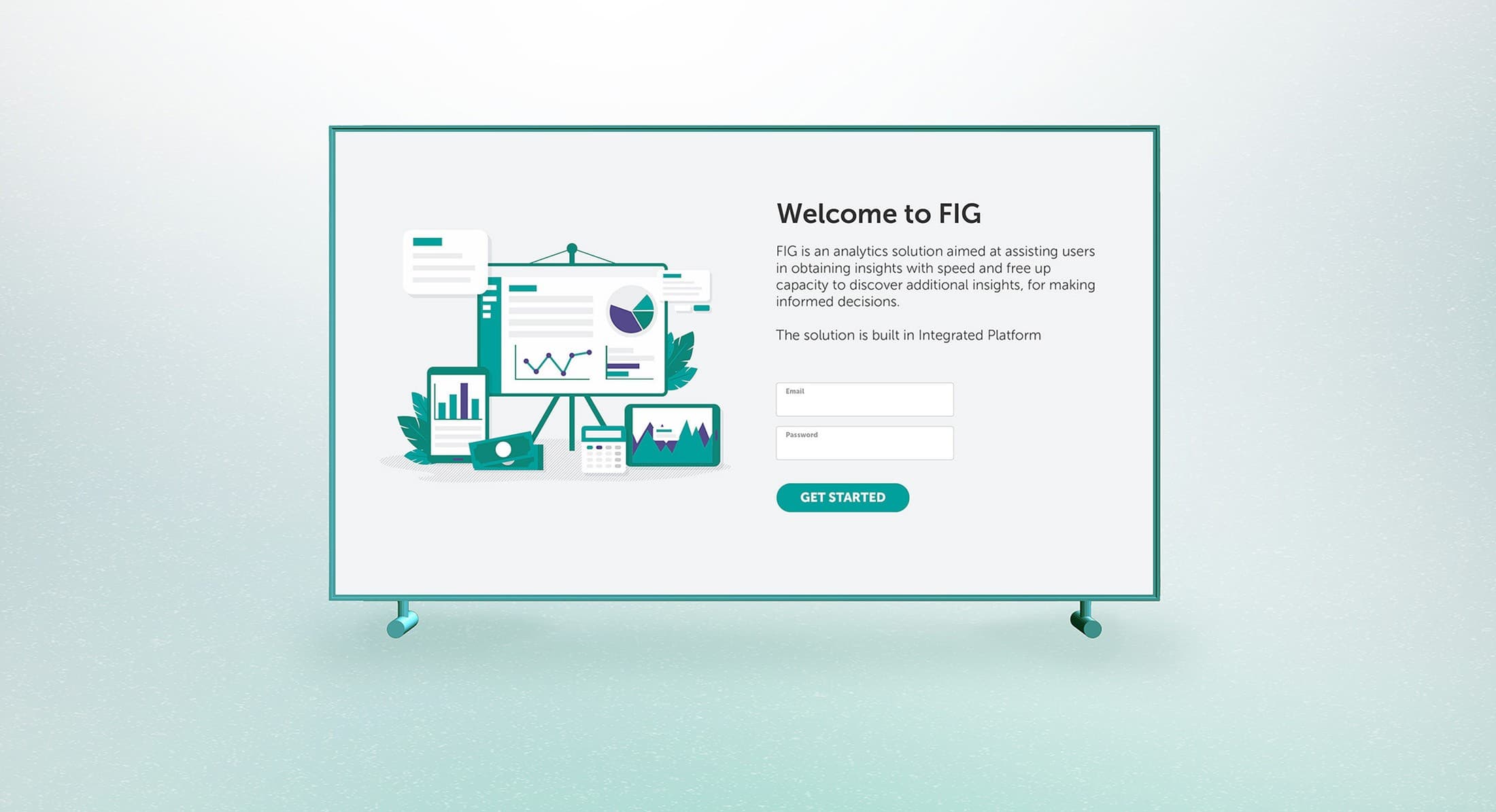
The existing financial dashboard was built from an off-the-shelf product with poor data architecture and a confusing user experience, causing a slow, manual process to gather financial insights and complete the monthly report. The upgraded Financial Insights Generator is an analytics solution aimed at assisting users in obtaining insights with speed, freeing up capacity to discover additional insights and make informed decisions.
The Challenge
How might we make better decisions based on financial insights?
The Goal
Improve efficiency in utilising mixed and manually collected data to generate financial insights.
The Pain Points
- Overlapping and duplicated tools, located in different toolboxes.
- Manual collection, consolidation, and transformation of data.
- Data accuracy and timeliness hampered by hard and soft barriers.
UX Research: As-is process
Before the team initiated the redesign project, Fjord conducted extensive research to lay the foundation for a digital experience that enables operations, planning, finance, and marketing professionals from the business to collaborate and communicate effectively. Interviews and workshops were conducted to deep-dive into the existing process and define the future-state journey.
Solution: Simplify layout
The current layout lacks a clear information hierarchy, resulting in ambiguity about the intended sequence for reading the information. We restructured the landing page around a clear reading order, from headline profitability figures down to detailed variances.
Solution: Personalised navigation
Different sets of personas view the data differently, so the dashboard navigation is embedded with a customisation feature. This allows users to pick and choose which set of data and which view is placed at the most accessible navigation.
Solution: Standardised navigation and filtering
We established a consistent navigation and filtering system to minimise the user's learning curve, shortening the time it takes to get familiar with navigating the pages and interacting with data across all sections.
- Expandable and collapsible sections give better control and avoid information overload.
- Three standard display choices for every dataset - line chart, waterfall chart, and table - let users analyse the data at multiple levels of detail.
Usability testing
We invited main users to participate in usability testing and A/B trials, aiming to gather feedback and insights that would help validate overall functionality.
Synthesised usability results
Users would still want to add their own insights and highlights beside the automated ones generated by the data variances. Having a platform that also houses the user's insights and highlights adds more value to the dashboard, especially when they are backed by the generated data.
Handover
Multiple iterations and usability tests were conducted, leading to a successful handover of the design to the development team within the agreed-upon timeline.
Next case study06
View all workStronger Together